Introduction
While working toward my master’s degree in applied statistics, I interned at the Tobacco Research Lab at NYU’s College of Global Public Health. During my internship, I collaborated with another researcher to study changing smoking states over time. We were interested in answering questions such as what proportion of cigarette smokers quit and what proportion of former smokers relapse.
We began our project by focusing on descriptive statistics and data visualization. To represent changes in smoking behavior over time, we used a data visualization technique called a Sankey diagram. I will be mainly focusing on Sankey diagrams in this post; however, I will also provide some background on the Population Assessment of Tobacco and Health (PATH) study.
Required R Skills
Preparing the data required some data manipulation. I used a few basic tidyverse functions to accomplish this. You can find many online tutorials on R and the tidyverse.
About the PATH Study and Data
The PATH study is a longitudinal study of tobacco use and attitudes funded by the National Institute of Health (NIH) and the Food and Drug Administation (FDA). The study began in 2013 and has aimed to follow the same respondents across multiple waves. The fourth and most recent wave ended in January of 2018. According to the FDA’s website, one of the study’s goals is to explore “patterns of tobacco product use, cessation, and relapse”, which aligned well with the focus of my internship.
States of Tobacco Use
The PATH survey offers a number of ways to classify smokers. For my internship, we focused on five states of cigarette smoking/cessation.
Smoking Behavior Classifications
- Current Established Smoker
- Former Established Smoker
- Current Experimental Smoker
- Former Experimental Smoker
- Never Smoker
The never smoker category is self-explanatory, but the other ones may require some clarification.
Established vs. Experimental Smokers
Established smokers were classified as respondents who reported to have smoked at least 100 cigarettes in their lifetime. Experimental smokers were those who reported smoking between 1 and 99 cigarettes in their lifetime.
Current vs. Former Smokers
Current smokers were those who reported currently smoking everyday or some days. Former smokers were those who had reported smoking at least one cigarette in their lifetime but were not smoking currently.
Our Objective
Our first objective was to create a Sankey Diagram to visualize these transitions across the three waves of data that were available at the time my internship.
A Brief History of Sankey Diagrams
Sankey diagrams are a type of flow chart used to model transitions over time. In a Sankey diagram, the proportion of each flow is represented by the width of the arrows.
Sankey diagrams are named after Captain Matthew Henry Phineas Riall Sankey, https://en.wikipedia.org/wiki/Sankey_diagram, an Irish engineer. In 1898, Sankey created a diagram of the flow of steam through an engine.
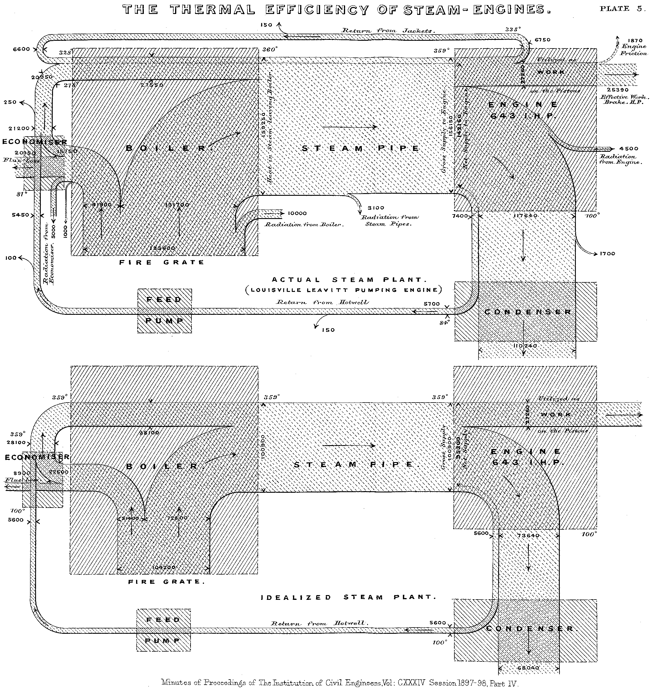
Figure 1: Original Sankey Diagram (Source: Wikipedia)
Another famous example was created by Charles Minard almost 30 years earlier. Minard’s diagram shows the movement of Napoleon’s army during his 1812 Russian campaign. In the visualization, the width of the arrow becomes thinner as casualties and desertions diminishes the size of Napoleon’s army.
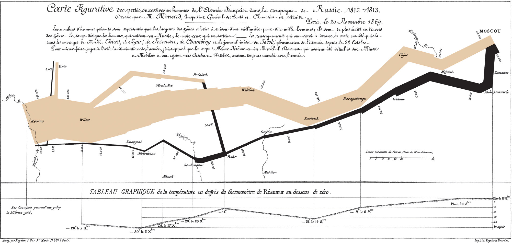
Figure 2: Sankey Diagram of Napoleon’s Russian Campaign (Source: Wikipedia)
Getting the Data in Shape
To create our own Sankey diagram, we decided to use Flourish Studio. Flourish offers a variety of interactive visualizations including three types of Sankey diagrams. We chose the multi-step alluvial Sankey diagram because each flow is measured at the same time points, namely each wave of the survey.
Before uploading our dataset, we needed to structure it to fit Flourish’s specifications. This is where R comes in handy. The Sankey Diagram dataset should have the following five columns.
- Column A: The Source of the flow
- Column B: The Target of the flow
- Column C: The Value of each flow, i.e. the number or proportion of units flowing from the source to the target at a given point in time
- Column D: The Step From column, which indicates the time point of the Source Column
- Column E: The Step To column, which indicates the time point of the Target column
Below is an example of how the data should be structured.
Each row in the dataset represents a unique flow or arrow between two waves of the study. For example, in the table above, there were 3,000 Never Smokers in Wave 1 (Rows 1 and 2). Of these 3,000 Never Smokers, 2,000 remained Never Smokers and 1,000 became Current Established Smokers in Wave 2.
Starting in Wave 2, there were 2,200 Current Established Smokers (Rows 7 and 8). Of these respondents, 1,800 remained Current Established Smokers and 400 became Former Smokers in Wave 3.
Step 1: Construct and Load PATH Dathset
So now it’s time to go back to our path data. I constructed the adult_panel csv file by merging together the first three waves of the study (Note: The fourth wave of the study was not available during the time of my internship). I also constructed a smoking status variable for each wave based on our five smoking behavior classifications.
I loaded this dataset into R. I only kept three variables: PERSONID , which is the unique ID of each respondent, and the three smoking category variable, one for each wave.
dta_raw <- read.csv("../../../data/adult_panel.csv", stringsAsFactors = TRUE)

dta <- dta_raw %>%
  dplyr::select(PERSONID, starts_with('smoking_status_full')) %>%
  tidyr::drop_na()

glimpse(dta)
## Rows: 21,400
## Columns: 4
## $ PERSONID <fct> P000000004, P000000005, P000000030, P000000074,…
## $ smoking_status_full_w1 <fct> never_smoker, current_exp_smoker, current_exp_s…
## $ smoking_status_full_w2 <fct> never_smoker, current_exp_smoker, current_exp_s…
## $ smoking_status_full_w3 <fct> never_smoker, current_exp_smoker, current_est_s…Note on Survey Weights
I only kept complete cases, i.e. adults who participated in each of the first three waves of the survey. I did this for simplicity. However, it’s important to note that to make valid inferences about the general population, we would need to adjust these numbers using survey weights. These survey weights are available in the original files. The survey weights would also allow us to adjust for item non-response and attrition.
In the future, I plan to create another diagram that adjusts each flow by the survey weights. In the meantime, using raw counts will help give us a rough estimate of smoking transition over time and allow us to demonstrate the steps needed to construct a Sankey Diagram on Flourish Studio. I’ve included a brief explanation of the Survey Weighting process at the end of this post.
Step 2: Transpose the Data
Now that we’ve loaded the data into R, we need to transpose the dataset into a “long” format. Each row will now represent a respondent’s smoking status in a particular wave. To transpose the data, we can use the pivot_longer() function from the tidyr package. By setting the cols parameter to “- PERSONID”, we can pivot all the columns to a long format except the PERSONID column.
In our new dataset, the name column represents the original variable name and the value column represents the status for each respondent during the wave indicated in the name column. For example, the first three columns represent the smoking status of respondent P000000004 across the first three waves of the study. We can observe that this individual reported being a “never smoker” in all three waves.
dta_long <- dta %>%
              tidyr::pivot_longer(cols = - PERSONID)
dta_long %>%  head
## # A tibble: 6 x 3
## PERSONID name value
## <fct> <chr> <fct>
## 1 P000000004 smoking_status_full_w1 never_smoker
## 2 P000000004 smoking_status_full_w2 never_smoker
## 3 P000000004 smoking_status_full_w3 never_smoker
## 4 P000000005 smoking_status_full_w1 current_exp_smoker
## 5 P000000005 smoking_status_full_w2 current_exp_smoker
## 6 P000000005 smoking_status_full_w3 current_exp_smokerNext we need to convert the name column into an integer. I used the str_sub() function from the stringr package to extract the wave number from the name column. We can then drop the original column.
dta_long <- dta_long %>%
              dplyr::mutate(wave = as.integer(str_sub(name, -1))) %>%
              dplyr::select(-name)

dta_long %>%  head
## # A tibble: 6 x 3
## PERSONID value wave
## <fct> <fct> <int>
## 1 P000000004 never_smoker 1
## 2 P000000004 never_smoker 2
## 3 P000000004 never_smoker 3
## 4 P000000005 current_exp_smoker 1
## 5 P000000005 current_exp_smoker 2
## 6 P000000005 current_exp_smoker 3Step 3: Create Source Dataset
The next step is to create two separate datasets: one for the source data and one for the target data. We can create the source dataset by dropping the latest wave. We exclude the latest wave because the rows in the source dataset represent the starting point of each flow. After we remove the latest wave, we can rename the value variable to source and the wave variable to step_from.
#drop the last wave
dta_source <- dta_long %>%
                dplyr::filter(wave != max(wave)) %>%
                rename(source = value,
                       step_from = wave)
dta_source %>%  head
## # A tibble: 6 x 3
## PERSONID source step_from
## <fct> <fct> <int>
## 1 P000000004 never_smoker 1
## 2 P000000004 never_smoker 2
## 3 P000000005 current_exp_smoker 1
## 4 P000000005 current_exp_smoker 2
## 5 P000000030 current_exp_smoker 1
## 6 P000000030 current_exp_smoker 2Step 4: Create Target Dataset
Next I created a Target dataset, which contains the endpoint of each flow. We can create this dataset by dropping the first wave from the original dataset. I renamed the value column to target and the wave column to step_to. These two columns represent the value and time at the end of each flow. Finally, I renamed the PERSONID column to avoid duplication.
#Drop first wave
dta_target <- dta_long %>%
              dplyr::filter(wave != 1) %>%
              rename(target = value,
                     step_to = wave,
                     PERSONID_2= PERSONID)

dta_target %>%  head
## # A tibble: 6 x 3
## PERSONID_2 target step_to
## <fct> <fct> <int>
## 1 P000000004 never_smoker 2
## 2 P000000004 never_smoker 3
## 3 P000000005 current_exp_smoker 2
## 4 P000000005 current_exp_smoker 3
## 5 P000000030 current_exp_smoker 2
## 6 P000000030 current_est_smoker 3Step 5: Append the Datasets
After we create the Source and Target datasets, we can append them using the cbind() function. In our new dataset, each row represents a transition for a particular respondent across two consecutive waves.
dta_sankey <- dta_source %>%
                  cbind(dta_target) %>%
                   dplyr::select(PERSONID, PERSONID_2, source, target, step_from, step_to)

dta_sankey %>%  head
## PERSONID PERSONID_2 source target step_from step_to
## 1 P000000004 P000000004 never_smoker never_smoker 1 2
## 2 P000000004 P000000004 never_smoker never_smoker 2 3
## 3 P000000005 P000000005 current_exp_smoker current_exp_smoker 1 2
## 4 P000000005 P000000005 current_exp_smoker current_exp_smoker 2 3
## 5 P000000030 P000000030 current_exp_smoker current_exp_smoker 1 2
## 6 P000000030 P000000030 current_exp_smoker current_est_smoker 2 3Checking Our Append Step
We can check our append step by making sure that each row now represents a step between two consecutive stages.
mean(dta_sankey$step_to - dta_sankey$step_from == 1)## [1] 1We should also make sure that in each row the PERSONID from the source dataset matches the PERSONID from the target dataset.
mean(dta_sankey$PERSONID == dta_sankey$PERSONID_2)## [1] 1Examples of Transitions
Now we can explore some rows to provide some context.
Here we can see six respondents who never smoked at Wave 1 but became current established smokers by Wave 2.
dta_sankey %>%
  filter(source =='never_smoker' & target == 'current_est_smoker' & step_from == 1  & step_to ==2)  %>%
  head
## PERSONID PERSONID_2 source target step_from step_to
## 1 P000009116 P000009116 never_smoker current_est_smoker 1 2
## 2 P000084125 P000084125 never_smoker current_est_smoker 1 2
## 3 P000124077 P000124077 never_smoker current_est_smoker 1 2
## 4 P000147567 P000147567 never_smoker current_est_smoker 1 2
## 5 P000162806 P000162806 never_smoker current_est_smoker 1 2
## 6 P000177195 P000177195 never_smoker current_est_smoker 1 2Here we can observe six respondents who were current established smokers at Wave 2 who became former smokers by Wave 3.
dta_sankey %>%
  filter(source =='current_est_smoker' & target == 'former_est_smoker' &
           step_from == 2  & step_to ==3)  %>%
  head
## PERSONID PERSONID_2 source target step_from step_to
## 1 P000001441 P000001441 current_est_smoker former_est_smoker 2 3
## 2 P000001710 P000001710 current_est_smoker former_est_smoker 2 3
## 3 P000002507 P000002507 current_est_smoker former_est_smoker 2 3
## 4 P000002531 P000002531 current_est_smoker former_est_smoker 2 3
## 5 P000003118 P000003118 current_est_smoker former_est_smoker 2 3
## 6 P000003641 P000003641 current_est_smoker former_est_smoker 2 3Note that some smoking transitions are impossible. For example, an established or experimental smoker can never go back to being a never smoker.
dta_sankey %>%
  filter(source %in% c('current_est_smoker',
                       'former_est_smoker',
                       'current_exp_smoker',
                       'former_exp_smoker'),
         target == 'never_smoker')
## [1] PERSONID PERSONID_2 source target step_from step_to
## <0 rows> (or 0-length row.names)Furthermore, established smokers can never become experimental smokers again. Once you’ve passed the 100-cigarette threshold, there’s no going back!
dta_sankey %>%
  filter(source %in% c('current_est_smoker', 'former_est_smoker'),
         target == c('current_exp_smoker', 'former_exp_smoker') )
## [1] PERSONID PERSONID_2 source target step_from step_to
## <0 rows> (or 0-length row.names)However, never smokers can become experimental smokers, and experimental smokers can become established smokers.
dta_sankey %>%
  filter(source == 'current_exp_smoker', target == 'current_est_smoker') %>%
  head
## PERSONID PERSONID_2 source target step_from step_to
## 1 P000000030 P000000030 current_exp_smoker current_est_smoker 2 3
## 2 P000000176 P000000176 current_exp_smoker current_est_smoker 1 2
## 3 P000001971 P000001971 current_exp_smoker current_est_smoker 1 2
## 4 P000002269 P000002269 current_exp_smoker current_est_smoker 1 2
## 5 P000002507 P000002507 current_exp_smoker current_est_smoker 1 2
## 6 P000002849 P000002849 current_exp_smoker current_est_smoker 1 2In addition, you can transition back and forth between being a former smoker and current smoker.
dta_sankey %>%
  filter(str_detect(source, 'est_smoker$'), str_detect(target, 'est_smoker$'), source != target) %>%
  head()
## PERSONID PERSONID_2 source target step_from step_to
## 1 P000000225 P000000225 current_est_smoker former_est_smoker 1 2
## 2 P000000470 P000000470 current_est_smoker former_est_smoker 1 2
## 3 P000001054 P000001054 former_est_smoker current_est_smoker 1 2
## 4 P000001142 P000001142 current_est_smoker former_est_smoker 1 2
## 5 P000001142 P000001142 former_est_smoker current_est_smoker 2 3
## 6 P000001371 P000001371 current_est_smoker former_est_smoker 1 2Step 6: Group and Summarize the Data
The last step before uploading our dataset is to aggregate the data. We can accomplish this using the group_by() and summarize() functions.
dta_sankey_cnt <-dta_sankey %>%
                    dplyr::group_by(source, target, step_from, step_to) %>%
                    dplyr::summarize(value =n(), .groups = "rowwise") %>%
                    dplyr::select(source, target, value, step_from, step_to) %>%
                    arrange(step_from, step_to)

dta_sankey_cnt %>%
  DT::datatable() %>%
  widgetframe::frameWidget()
There are 34 rows in our new dataset. Each row represents a transition between two smoking states across two consequent waves. The number in the value column indicates the number of respondents in each flow. For example, there were 889 respondents who went from being “current established smokers” to “former established smokers” from Wave 1 to Wave 2 (indicated by the step_to and step_from columns).
Step 7: Export and Upload Data to Flourish Studio
Now that our dataset is in the shape we need, we can upload it to Flourish studio. First we can use export the data as a csv file.
write_csv(dta_sankey_cnt, "../../../data/path_sankey.csv")Next we can log on to our Flourish studio account and use the following steps to upload our data.
Uploading Data to Flourish Studio
- Click the muti-stage alluvial plot under the Sankey Diagram visualization.
- Click the data button above the diagram
- Click the “Upload Data” on the right
- Select the file containing your data.
Flourish should automatically recognize the correct columns in your dataset if you have arranged them in the following order: Source, Target, Value, Step From, Step to. You can use the control panel in the right sidebar to make any necessary corrections. If everything looks okay, click the “Preview” button.
And voila, we now have a Sankey diagram!
Our Brand New Sankey Diagram!
We can give our Sankey diagram a name by clicking on the top of the page. Finally, we can click “Export & publish” on the upper right. You have the options of downloading your diagram or publishing it. Only publish your diagram if you’re sure that the diagram does not contain any sensitive information (Note: there is an option to require a password to view your Sankey Diagram but this is only available with Flourish’s paid business account).
Using our Sankey Diagram to Explore Cigarette Smoking Patterns over Time
The first thing I noticed was that the thickest line from each state flows into the same state in the next wave. In other words, your most likely state in the next wave is your state in the current wave.
Another thing that I noticed was that the “never smokers” flow seemed to be the most stable. Never smokers in Wave 1 tended to stay never-smokers in Waves 2 and 3. This stability is likely to due to the fact that all the respondents were over the age of 18 during the first wave of the study. Adults who are never smokers do not tend to take up smoking later in life. For this reason, it would also be interesting to explore the Youth survey to investigate how respondents under the age of 18 started to experiment with cigarette smokers.
We were also interested in exploring relapse rates among former established smokers over time. From Wave 1 to Wave 2, about 12% (432 out 3,607) of former established smokers relapsed.
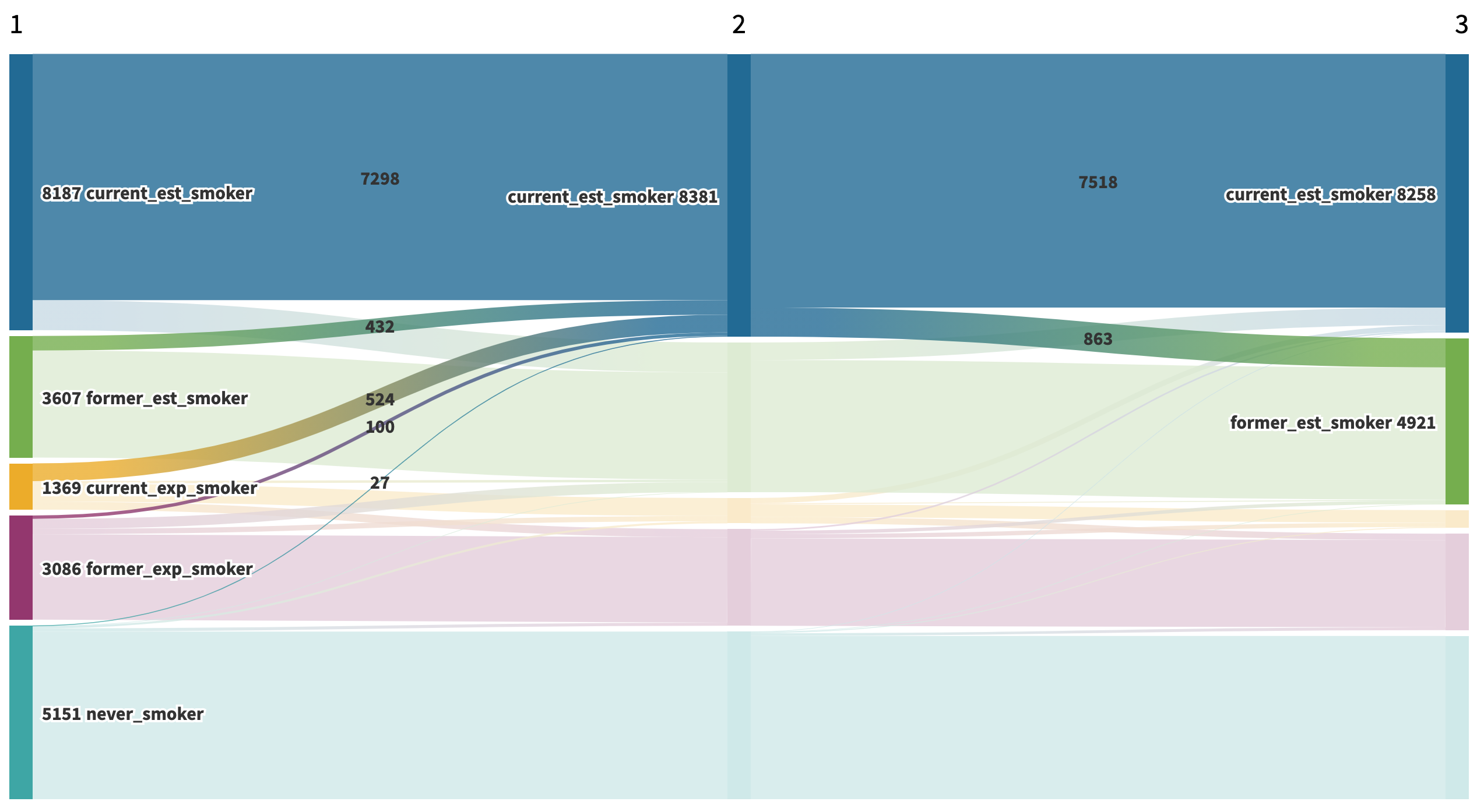
Figure 3: Wave 1 to Wave 2 Relapse among Former Established Smokers
About the same proportion (12.4% or 521 out of 4,437 to be exact) relapsed between Waves 2 and 3.
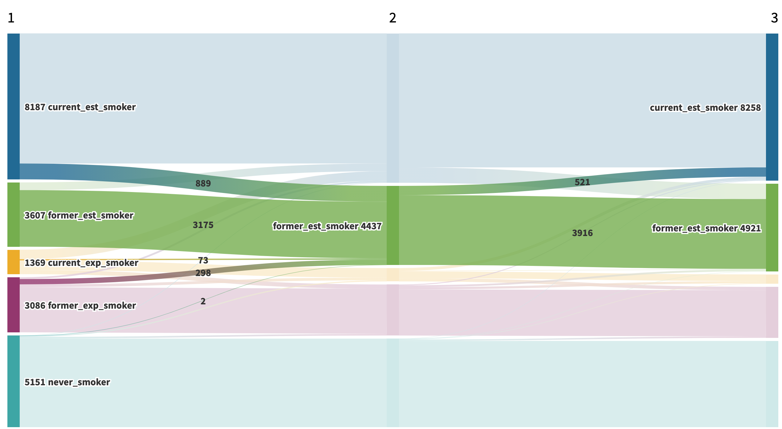
Figure 4: Wave 2 to Wave 3 Relapse among Former Established Smokers
Conclusion
Creating a Sankey Diagram is a great way to explore transitions over time. For example, upon viewing the Sankey diagram, it becomes clear that the never smokers category is remarkably stable over time. I look forward to create more Sankey diagrams to explore other longitudinal datasets.
Recap of Data Processing Steps
- Construct and Load PATH dataset
- Transpose Data
- Create Source Dataset
- Create Target Dataset
- Append Source and Target Data
- Group and Summarize Data
- Export Data as csv and Upload to Flourish Studio
Future Directions for PATH Data
I have a few additional ideas of things to do with the PATH data. Some of these would be building on the work that I already did during my internship and other ones would be charting new territory.
- Add Wave 4 data
- Create another Sankey Plot adjusting the value of each flow by the survey weights
- Create a tutorial about how to use the surveyR package with PATH data
- Fit a multinomial logistic regression to explore smoking transitions across two waves of the study
- Use multi-state modeling to investigate probabilities of smoking transitional states across multiple waves. I included a brief introduction to multi-state modeling in the Appendix.
Appendix
A1: Original Datasets
You can download the public-use datasets here.
The files DS1001, DS2001, DS3001, and DS4001 correspond to waves 1 through 4 of the adult survey.
Once you download these datasets you can merge them by the variable PERSONID. This creates a “wide” dataset in which each column contains a particular variable from a single wave. In my adult_panel dataset, I added suffixes (w1, w2, w3) to indicate which wave each variable comes from. The original variable names include the prefix R01, R02, R03, and R04 where “R” refers to the adult survey and the numbers refer to the corresponding waves.
A2: Original Variables
The dataset includes the original questions used to derive each smoking category as well as a series of derived indicator variables for each category.
Derived Smoking Category Variables
- R01R_A_CUR_ESTD_CIGS: Wave 1 Current Established Smokers
- R01R_A_CUR_EXPR_CIGS: Wave 1 Current Experimental Smokers
- R01R_A_FMR_ESTD_CIGS: Wave 1 Former Established Smokers
- R01R_A_FMR_EXPR_CIGS: Wave 1 Former Experimental Smokers
The variables in the other datasets have the same name with the number after the initial “R” representing the wave of the study. The only other difference is that the wave 2 and wave 3 “former” smoker categories have a "_REV" suffix, e.g. R02R_A_FMR_ESTD_CIGS_REV represents wave 2 former established smokers.
To find wave 1 never smokers, you can use the variable R01R_A_NVR_CIGS. To find never smokers in waves 2 and 3, you can use the R02R_A_EVR_CIGS and R03R_A_EVR_CIGS variables.
The dataset also includes indicators for whether a person was a “continuing adult” in a given wave of the study. However, we can use a inner join to constrain our sample to include only adults from wave 1 who participated in all the subsequent waves ot the study.
A3: Survey Weighting
The survey actually has a series of weights to adjust for both attrition and non-representativeness of the sample. The weights take into account several factors.
- Complex sampling design: As in most surveys, the PATH study used both stratification and clustering sampling methods instead of simple random sampling.
- Intentional Oversampling: The PATH survey intentionally over samples people between the ages of 18 and 34 as well as African-American adults.
- Non-response bias: Not every one who is contacted agrees to participate in the survey. The survey weights account for differential response rates.
- Attrition: Some respondents end up dropping out of the study after participating in the first wave.
Click here for a full description of the survey weighting process.
A4: Multi-state Modeling
Multi-state modeling is a good tool for estimating the probability of transitioning from one discrete state to another Therneau, Crowson, & Atkinson, 2021. Multi-state modeling is essentially a generalization of survival analysis (ibid). However, in survival analysis there are only two stages, life and death, and you can only transition from the first state to the second.
On the other hand, in multi-state modeling there can be more than two states and it can be possible to revert back to a previous state. For example, in our study, it is possible to transition back and forth between being a current established smoker and a former established smoker. The major assumption of multi-state modeling is that your next state only depends on your current state. Christopher Jackon’s msm package is a good tool for using multi-state modeling in R.