Introduction
As a former teacher, I’m often intrigued by the way in which education issues provoke such strong feelings among non-educators. Teacher unions tend to elicit particularly strong opinions.
Since so many people have strong opinions about unions, I decided to perform a state-level exploratory analysis of the relationship between test scores and unionization rates.
Standard Correlation vs. Causation Caveat
Of course, I need to start with the caveat that these data are purely correlational. Any inferences made based these charts should be taken with a grain of salt!
Finding Test Scores Data
NAEP
I used NAEP data for the state-level math and reading scores.
NAEP stands for National Assessment of Education Progress. It is administered by the NCES (National Center for Education Statistics ) to students across the United States. It is often referred to as the “Nation’s Report Card” for several reasons:
- It is generally considered to be high quality.
- It has been administered every few years since 1969.
- Unlike high stakes exams, the same test is administered across the nation.
Why focus on 8th grade test scores?
Each assessment year, a representative sample of students from grades 4, 8, and 12 take the test. I focus on grade 8 instead of grade 12 because there is some concern that seniors do not take the test as seriously (See here). Consequently, grade 8 is the latest grade for which we have data before “senioritis” becomes a concern.
Obtaining the Data
Unionization Data
After a great deal of searching, I was able to find 2017-2018 state-level unionization rates from the National Teacher and Principal Survey. Unfortunately, there were no data from Maryland or DC due to low response rates.
NAEP Data
TFinding NAEP test data was much simpler. There is an easy-to-use data portal on their website. You can select the year, grade-level, subject, and jurisdiction you are looking for. I used this tool to create two state-level datasets with the 2019 math and reading NAEP results.
library(dplyr)
library(ggplot2)
library(ggrepel)

setwd('../../..')
naep_mth <- read.csv('data/state_naep_mth2019.csv')
naep_ela <- read.csv('data/state_naep_ela2019.csv')
pct_union <- read.csv('data/state_pct_union.csv')

ed_dta <- naep_mth %>%
            inner_join(naep_ela, by = 'State')  %>%
            inner_join(pct_union, by = 'State')

state_abb <-   append(state.abb, 'DC', after =8)

ed_dta <- ed_dta %>%
            rename(state_name = State) %>%
            mutate(state = state_abb)

ed_dta %>%  head()
## state_name naep_mth_2019 naep_ela_2019 pct_union state
## 1 Alabama 269 253 73.0 AL
## 2 Alaska 274 252 86.0 AK
## 3 Arizona 280 259 31.0 AZ
## 4 Arkansas 274 259 26.1 AR
## 5 California 276 259 90.7 CA
## 6 Colorado 285 267 57.2 COVisualizations
Reading Tests and Unionization
I used ggplot to create a scatterplot of NAEP reading scores over unionization rates by state. I used the geom_text_repel() function from Kamil Slowikowski’s ggrepel package to ensure that none of the labels overlapped. Finally, I used geom_smooth to create a fitted OLS regression line.
ed_dta %>%
  filter_all(~!is.na(.)) %>%
  ggplot(aes(x=pct_union, y= naep_ela_2019, label = state)) +
  geom_point() +
  geom_text_repel(size = 2) +
  geom_smooth(method = 'lm',
              se = FALSE,
              linetype = 'dashed',
              color = 'red',
              size = 0.5) +
  theme_bw() +
  theme(panel.grid = element_blank())+
scale_x_continuous(limits = c(0,100)) 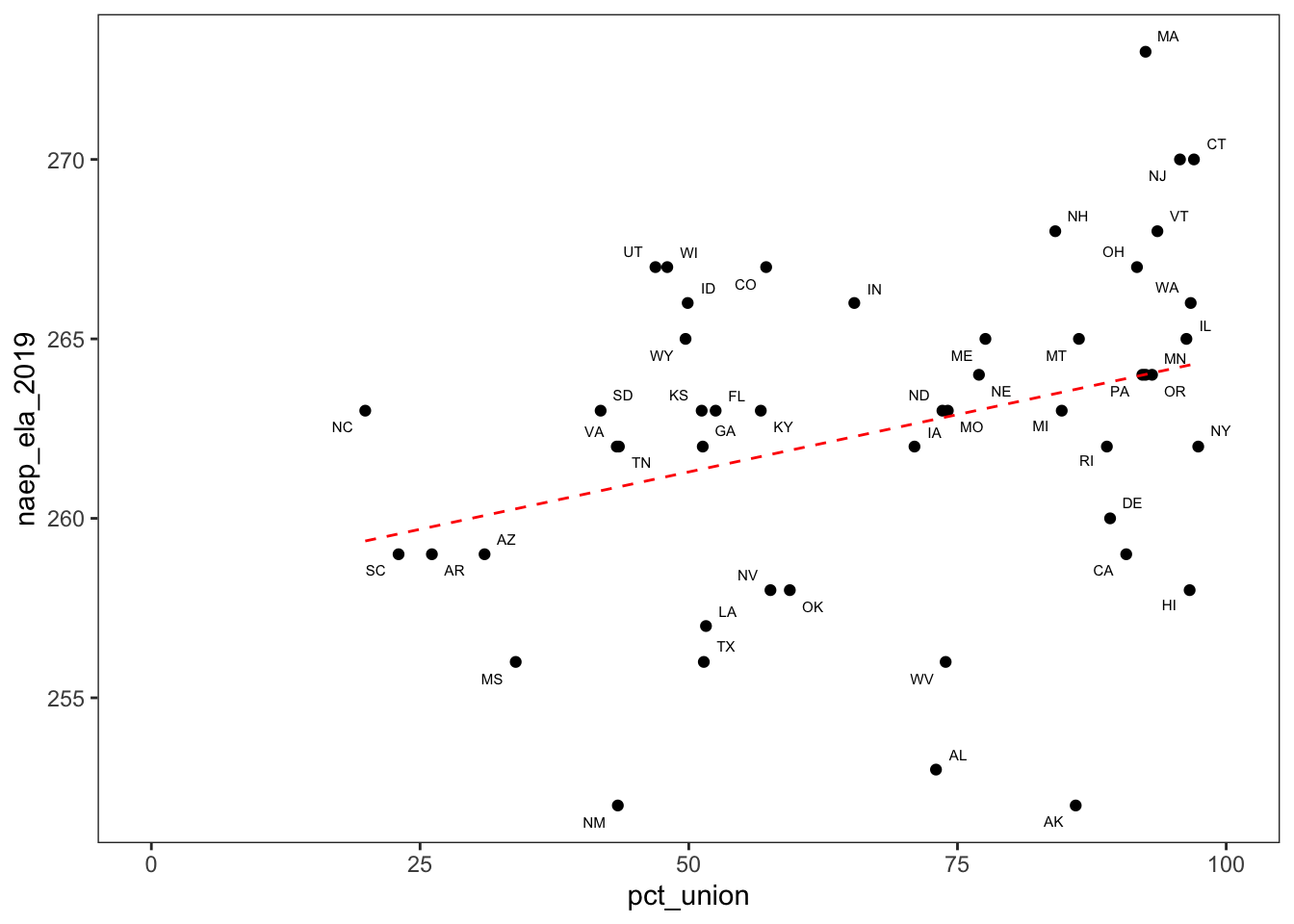
Based on the graph, there may be a correlation between NAEP reading scores and unionization. Of course, as I’ve already warned, correlation does not imply causation! There could be a third variable that explains both high unionization rates and high reading test scores.
Even the correlation between the two variables may be suspect. For example, you could argue that if we remove Massachusetts and the trend line, the positive relationship would not be so apparent.
cor(ed_dta$naep_ela_2019, ed_dta$pct_union, use = 'complete.obs') %>% round(2)## [1] 0.32The correlation between state-level NAEP reading scores and unionization is .32, which is weak to moderate.
fit <- lm(naep_ela_2019 ~ pct_union, ed_dta)
summary(fit)
##
## Call:
## lm(formula = naep_ela_2019 ~ pct_union, data = ed_dta)
##
## Residuals:
## Min 1Q Median 3Q Max
## -11.5948 -2.3236 0.6235 3.0408 8.9896
##
## Coefficients:
## Estimate Std. Error t value Pr(>|t|)
## (Intercept) 258.09693 1.96410 131.408 <2e-16 ***
## pct_union 0.06393 0.02745 2.329 0.0242 *
## ---
## Signif. codes: 0 '***' 0.001 '**' 0.01 '*' 0.05 '.' 0.1 ' ' 1
##
## Residual standard error: 4.415 on 47 degrees of freedom
## (2 observations deleted due to missingness)
## Multiple R-squared: 0.1034, Adjusted R-squared: 0.08437
## F-statistic: 5.423 on 1 and 47 DF, p-value: 0.02422The coefficient of unionization is statistically significant. Once final warning, this evidence is just correlational, so we shouldn’t read too much into it.
Math Tests and Unionization
I also plotted NAEP math scores over unionization. Based on the scatterplot, math test scores do not seem to be as strongly correlated with unionization as reading test scores were.
ed_dta %>%
  filter_all(~!is.na(.)) %>%
  ggplot(aes(x=pct_union, y= naep_mth_2019, label = state)) +
  geom_point() +
  geom_text(position = position_dodge(width = 0.1), vjust = 2, size = 2) +
  geom_smooth(method = 'lm',
              se = FALSE,
              linetype = 'dashed',
              color = 'red',
              size = 0.5) +
  theme_bw() +
  theme(panel.grid = element_blank()) +
scale_x_continuous(limits = c(0,100)) 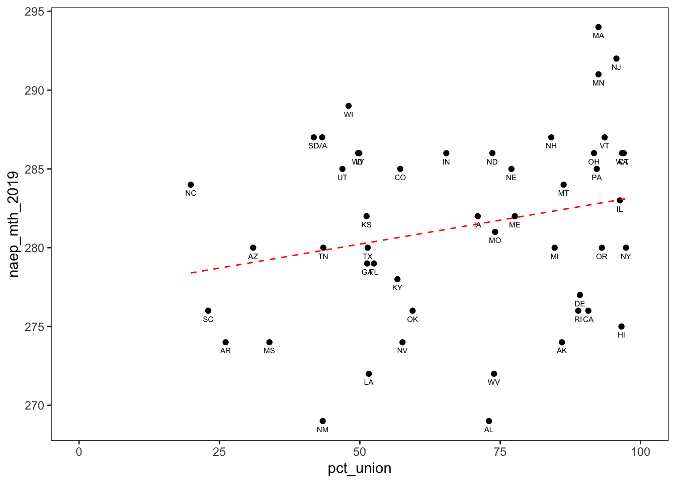
Indeed, the Pearson correlation coefficient is below .3.
cor(ed_dta$naep_mth_2019, ed_dta$pct_union, use= "complete.obs") %>%
  round(2)
## [1] 0.24Finally, we can observe that relationship is not statistically significant at the .05 threshold.
fit <- lm(naep_mth_2019 ~ pct_union, ed_dta)
fit %>%  summary
##
## Call:
## lm(formula = naep_mth_2019 ~ pct_union, data = ed_dta)
##
## Residuals:
## Min 1Q Median 3Q Max
## -12.625 -4.774 0.168 4.339 11.190
##
## Coefficients:
## Estimate Std. Error t value Pr(>|t|)
## (Intercept) 277.18836 2.58150 107.375 <2e-16 ***
## pct_union 0.06077 0.03608 1.684 0.0987 .
## ---
## Signif. codes: 0 '***' 0.001 '**' 0.01 '*' 0.05 '.' 0.1 ' ' 1
##
## Residual standard error: 5.803 on 47 degrees of freedom
## (2 observations deleted due to missingness)
## Multiple R-squared: 0.05692, Adjusted R-squared: 0.03686
## F-statistic: 2.837 on 1 and 47 DF, p-value: 0.09875Plotting Math and ELA Together
After creating the two previous graphs, I noticed that there were a few states that appeared near the top in one subject and not the other. For example Minnesota was ranked third in Math in 2019 but was ranked seventeenth in ELA. On the other hand, Connecticut was ranked second in reading and only ninth in math.
ed_dta <- ed_dta %>%
          mutate(naep_mth_rnk_2019 = rank(-naep_mth_2019, ties.method = 'min'),
                 naep_ela_rnk_2019 = rank(-naep_ela_2019, ties.method = 'min'))


ed_dta %>%
  filter(state %in% c('MN', 'CT')) %>%
  select(state_name, naep_mth_rnk_2019,naep_ela_rnk_2019)
## state_name naep_mth_rnk_2019 naep_ela_rnk_2019
## 1 Connecticut 9 2
## 2 Minnesota 3 17I decided to explore the relationship between reading and math scores by creating another scatterplot with reading scores on the y-axis and math scores on the x-axis. Based on this scatterplot,we can see that reading and math test scores are highly correlated.
ed_dta %>%
  ggplot(aes(x=naep_mth_2019, y= naep_ela_2019, label = state)) +
  geom_point() +
  geom_text_repel(size = 2) +
  geom_smooth(method = 'lm',
              se = FALSE,
              linetype = 'dashed',
              color = 'red',
              size = 0.5) +
  theme_bw() +
theme(panel.grid = element_blank()) 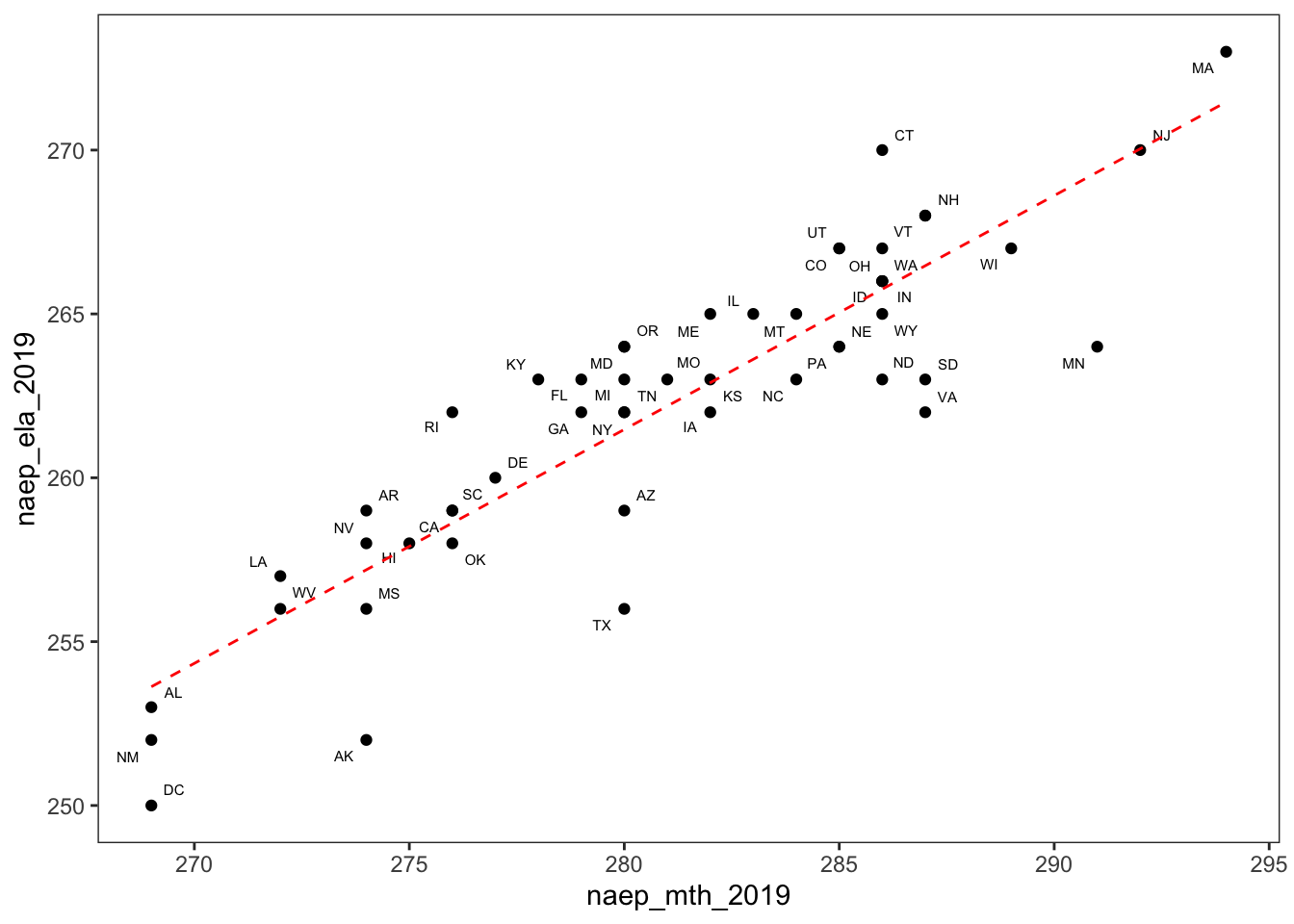
The Pearson correlation coefficient was 0.89, indicating a strong correlation between the two. This high correlation coefficient is consistent with the scatterplot.
cor(ed_dta$naep_mth_2019, ed_dta$naep_ela_2019) %>% round(2)## [1] 0.89Finally, the relationship between math and reading NAEP scores was also statistically significant.
fit <- ed_dta %>%
  lm(formula =naep_ela_2019 ~ naep_mth_2019)
summary(fit)
##
## Call:
## lm(formula = naep_ela_2019 ~ naep_mth_2019, data = .)
##
## Residuals:
## Min 1Q Median 3Q Max
## -5.4740 -0.9719 0.3807 1.5281 4.2439
##
## Coefficients:
## Estimate Std. Error t value Pr(>|t|)
## (Intercept) 61.64092 14.71894 4.188 0.000117 ***
## naep_mth_2019 0.71369 0.05236 13.630 < 2e-16 ***
## ---
## Signif. codes: 0 '***' 0.001 '**' 0.01 '*' 0.05 '.' 0.1 ' ' 1
##
## Residual standard error: 2.239 on 49 degrees of freedom
## Multiple R-squared: 0.7913, Adjusted R-squared: 0.787
## F-statistic: 185.8 on 1 and 49 DF, p-value: < 2.2e-16Ploting Math and ELA with Unionization as a Categorical Factor
To explore unionization rates while plotting reading over math test scores, I created a factor that binned unionization into two categorizes based on an 80% threshold.
ed_dta <-ed_dta %>%
  mutate(unionized = as.factor(if_else(pct_union >= 80,  "80% or Above", "Below 80%")))

  ed_dta %>%
  filter_all(~!is.na(.)) %>%
  ggplot(aes(x=naep_mth_2019, y= naep_ela_2019,
              label = state, color = unionized, group = unionized)) +
  geom_point() +
  geom_text_repel(size = 2) +
  geom_smooth(method = 'lm',
              se = FALSE,
              linetype = 'dashed',
              color = 'gray', size = 0.5,
              inherit.aes = FALSE,
              aes(x=naep_mth_2019, y = naep_ela_2019)) +
  theme_bw() +
  theme(panel.grid = element_blank())  +
    scale_color_manual(values = c('blue', 'red'))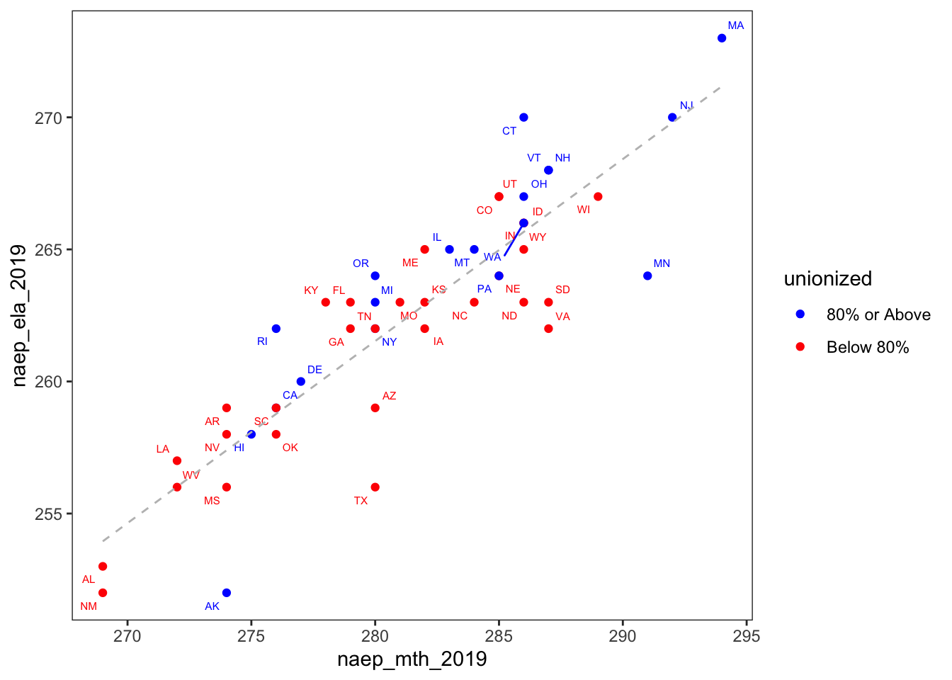
You can explore a lot of things in this graph. One thing I found interesting was that Wisconsin was the only state in the Great Lakes region that had a unionization rate below 80%. Also, among the states below the 80% unionization threshold, it had the highest math score and among the highest reading scores. I think this graph shows how plotting reading and math along the y and x axes provides a fuller picture of student performance.
Why Do Students in Minnesota Peform Better in Math than Reading?
Of course, it’s not very surprising that reading and math scores are highly correlated . What I find more interesting are the states in which students performed better in one subject than the other. For example, Alaska, Texas, and Minnesota seem to have much lower ELA scores than you would expect given their math scores. This is apparent based on how far they lie below the regression line. On the other hand, based on how far it lies above the regression, Connecticut has much lower math scores than what you predict given its reading scores.
Observing these outliers generates some new interesting questions that I hadn’t thought about when I first started working with these data.
- Do some states do better on one subject compared to another? Or is this just noise?
- Is there some common factor about Texas, Alaska, and Minnesota that explains their better performance in math? Or are there different factors for each state?
These new questions about discrepancies in reading/math performance may contain more unexplored territory than the often discussed topic of teacher unions.
Conclusions
Running into obstacles while trying new things can open new doors. Having difficulty creating plots without overlapping state labels led me to discover the ggrepel package.
Sometimes, exploring data can lead to new questions that are more interesting than your original question.
It is often useful to explore a construct on more than one dimension. The reading over math scatterplots helped us to simultaneously look at two dimensions of student performance.